
 Visual case study
AMO — one office, designed as one system
A public charter site and an internal portfolio console for an Account Management Office. Same palette, same grid, two very different jobs — and a mirrored Hebrew build of the whole thing.
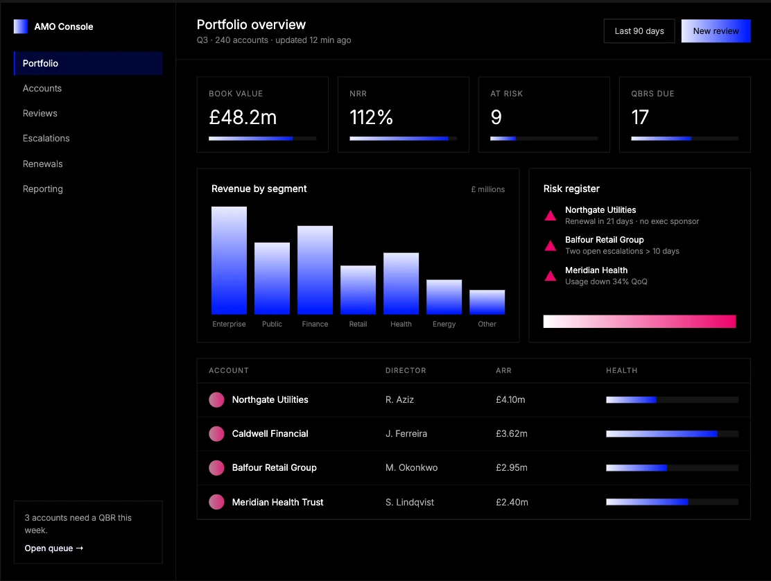
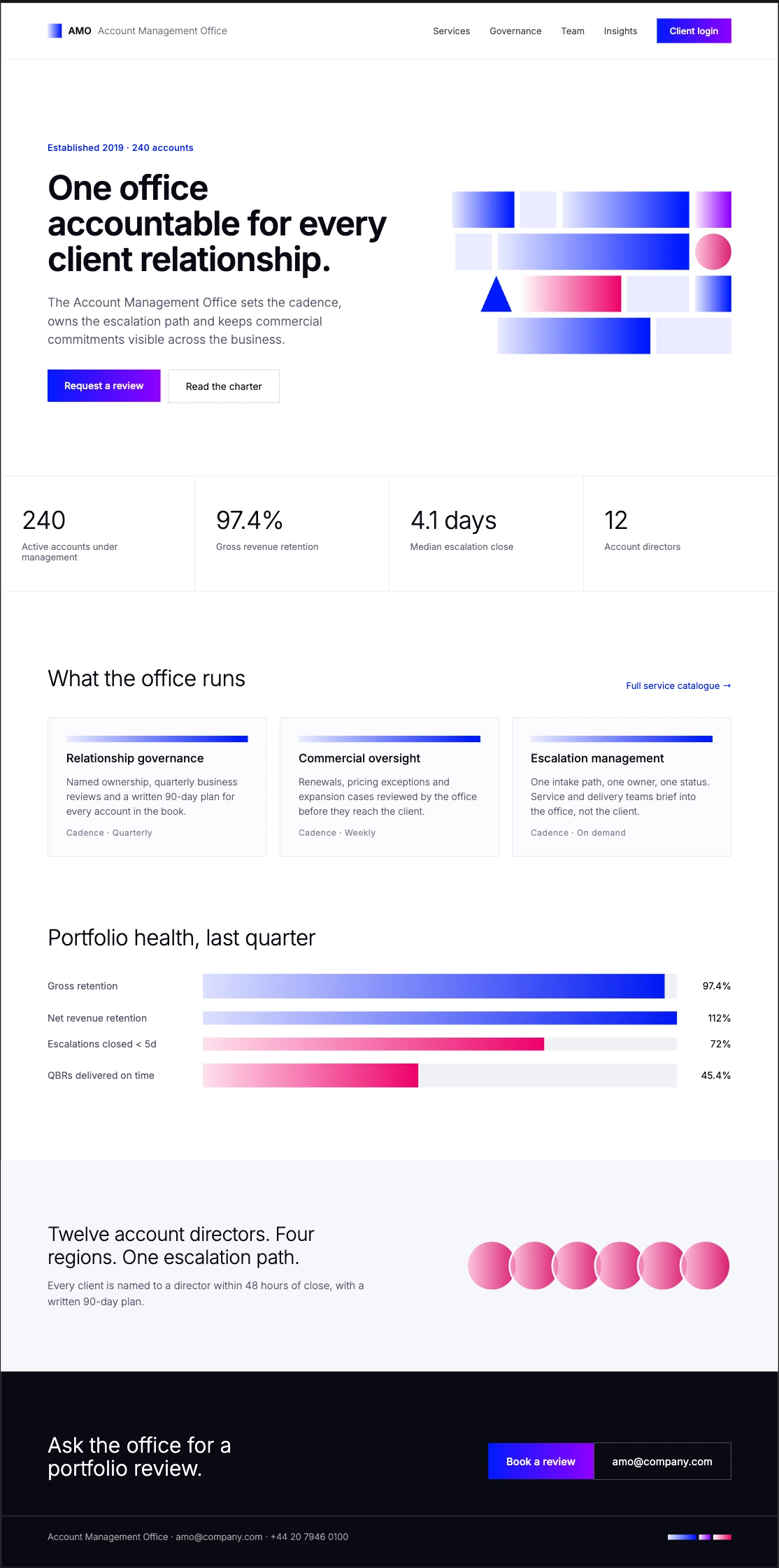
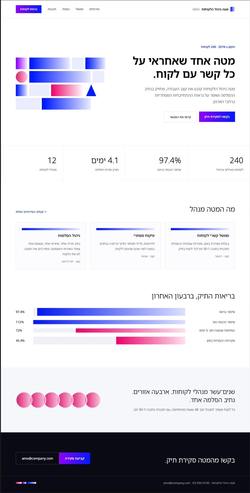
Two audiences, one system. The public site has to convince a client that someone is accountable; the console has to let that someone act before the QBR. One palette, two temperatures — white paper outside, black inside.
The Hebrew build is where it got interesting. Flipping type is trivial; flipping meaning is not — a bar that fills from the left reads as growth in English and as decline in Hebrew until you flip the gradient with it.
                     ┌──────────────┐
        client ─────▶│  amo.site    │  charter · LTR + RTL
                     └──────┬───────┘
                            │ request a review
                            ▼
   director ───────▶ ┌──────────────┐ ◀─────── exec
                     │  amo console │  portfolio, risk, QBR queue
                     └──────┬───────┘
                            │ escalation opened
                            ▼
                     ┌──────────────┐
                     │  one owner   │  named in 48 h · 90-day plan
                     └──────────────┘
client ──▶ ┌──────────┐
│ amo.site │
└────┬─────┘
▼
director ─▶ ┌──────────┐ ◀─ exec
│ console │
└────┬─────┘
▼
one owner · 48 hMirroring a layout is typography. Mirroring a chart is editing.